
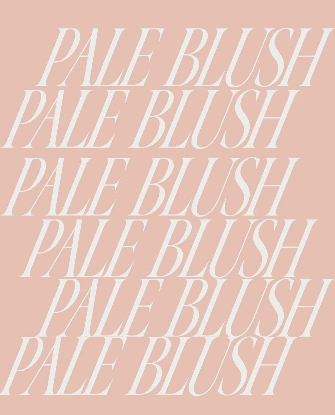
The Color Archive: July's Color of the Month — Pale Blush
Every month, we explore a color—not simply for how it looks, but for what it communicates.
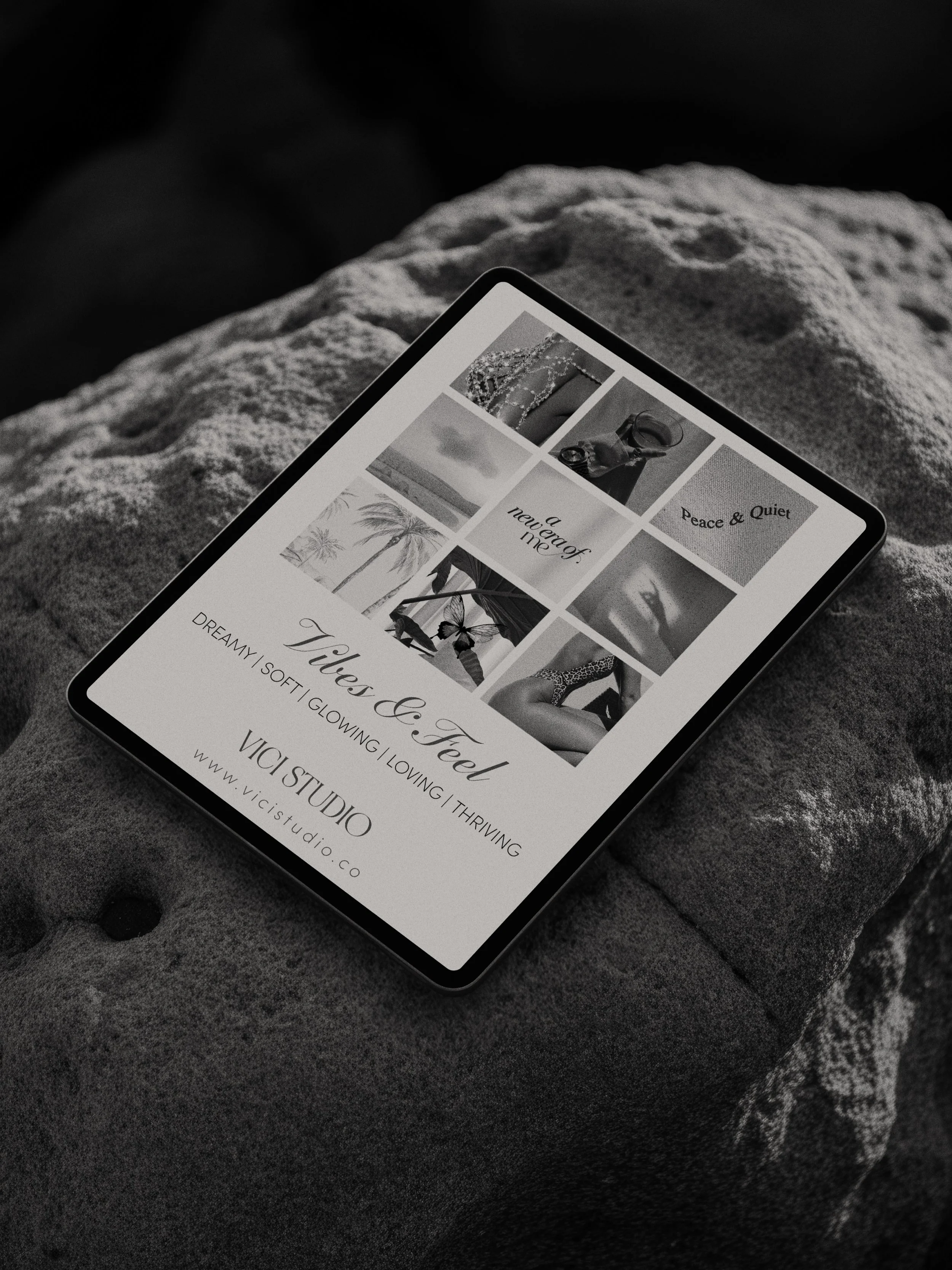
Welcome to The Color Archive, a monthly series by VICI Studio dedicated to the psychology of color, branding, and visual storytelling.
July's featured color is Pale Blush.
A hue that feels quiet, compassionate, and effortlessly confident.
It reminds us that the strongest brands don't always command attention—they create emotion.

Before someone reads your headline...
Before they remember your logo...
Before they understand your story...
They experience your color.
Research consistently shows that color influences first impressions, emotional responses, and purchasing decisions. The right palette doesn't simply make a brand beautiful—it makes it memorable.
Color becomes a feeling. And feelings build brands.

July's Color: Pale Blush
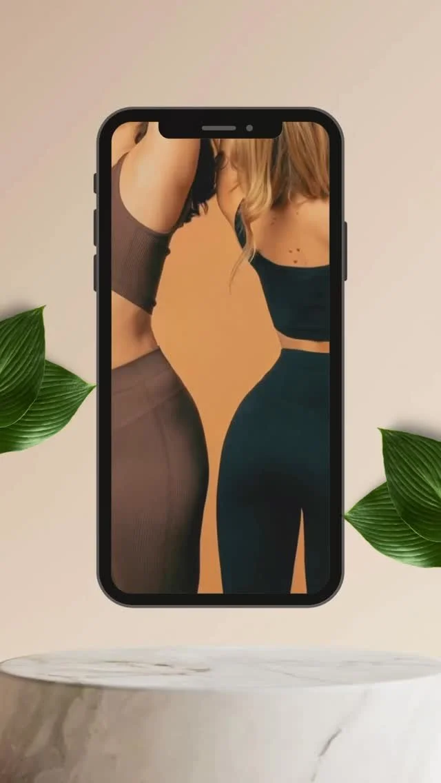
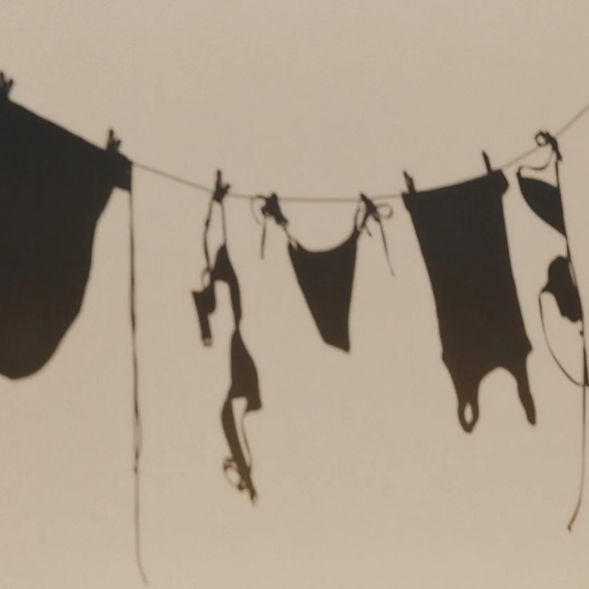
Pale Blush sits between warmth and neutrality.
It carries the softness of pink without feeling overly feminine, making it a versatile choice for brands that want to communicate humanity, calm, sophistication, and emotional intelligence.
Unlike louder pinks, Pale Blush whispers rather than shouts.
That's exactly where its power lies.
The Psychology of Pale Blush

Pale Blush is often associated with:
Quiet confidence | Compassion | Emotional balance | Gentleness | Optimism | Self-awareness | Calm |Trust | Warmth | Approachability
Rather than demanding attention, it creates comfort. For brands, this translates into experiences that feel welcoming, thoughtful, and deeply human.
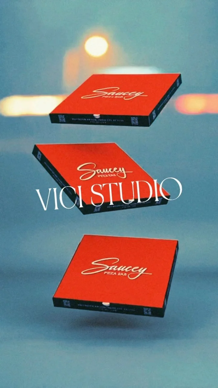
Brands That Could Embrace Pale Blush

How We Would Use Pale Blush
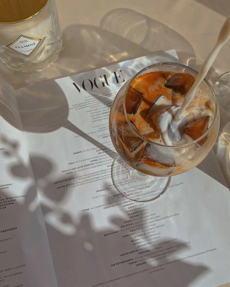
At VICI Studio, we believe color should support a story. Rather than becoming the entire identity, Pale Blush works best as an emotional layer within a broader visual system. We love pairing it with:
Warm Ivory
Espresso Brown
Soft Black
Charcoal
Sage
Champagne Gold
Stone
The result feels timeless, editorial, and quietly luxurious.
Final Thoughts


Every month has a feeling. Sometimes that feeling begins with color. July reminds us that softness isn't weakness. It's confidence without needing to announce itself. We'll see you next month with another chapter of The Color Archive.
Looking for a brand palette that tells your story?
At VICI Studio, we create thoughtful brand identities rooted in strategy, emotion, and timeless design.